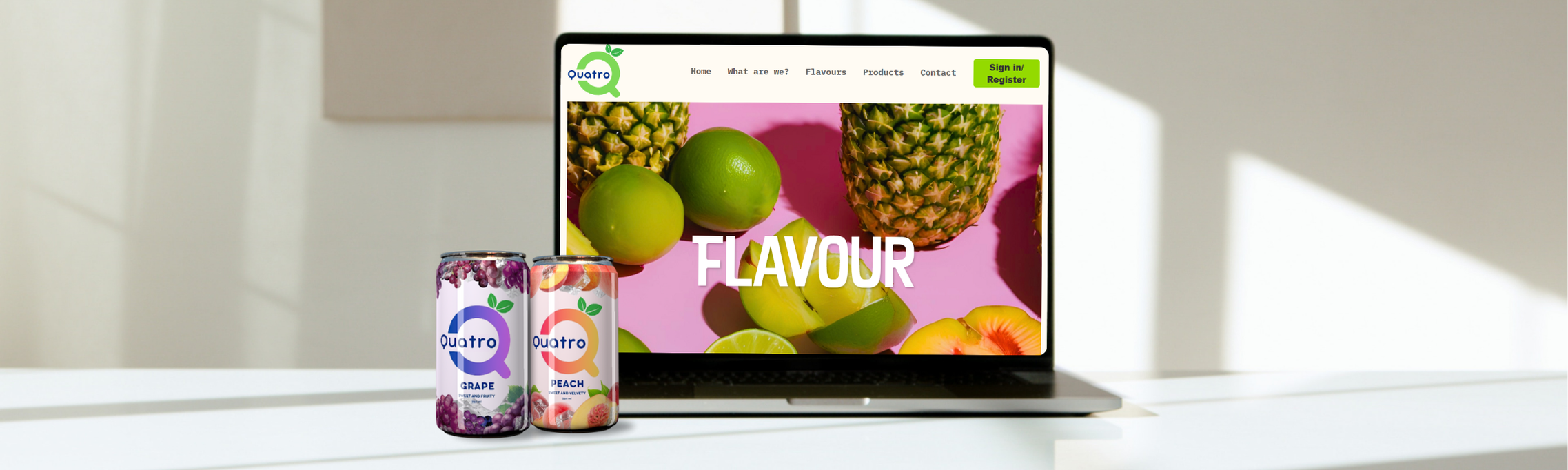
"We collaborated to design the logo and label for Quatro, a tropical carbonated drink, focusing on a vibrant and refreshing look. We also developed a responsive website to showcase the drink's unique features, product details, and brand story, targeting young adults who enjoy fruity, refreshing beverages."
Kyuri Park, Stephanie Chan
2024


The goal was to establish a strong brand identity for Quatro, a carbonated tropical drink. While designed for all age groups, the primary focus was on athletes and physical workers. The branding utilized vibrant colors and real fruit imagery to enhance its energetic and refreshing appeal.


Age Range: 13-40
Gender: All
Location: North America
Occupation/Industry: Sports, leisure, construction
Education Level: All
Psychographics: Active and health-conscious individuals who enjoy refreshing, energizing beverages. They seek convenience, bold flavors, and products that complement their active lifestyle.

Use vibrant, adaptable colors (e.g., #7ED957, #39B54A, #00338C) for a lively, flavor-specific vibe across the website and branding.
Apply 'Bubbley Neue' font throughout the logo, website text, and branding for a unified, playful identity.
Ensure clean layouts, white space, simple language, and intuitive navigation for an engaging and trustworthy user experience.
Create the "Q" logo using the font 'Bubbley Neue' to maintain consistency with the rest of the text. Ensure that the "quatro" text within the logo is also in the same font.
#7ED957(light green), #39B54A(darker green), #00338C(navy) are the main color for the logo but they could be changed based on the flavours of the drink.
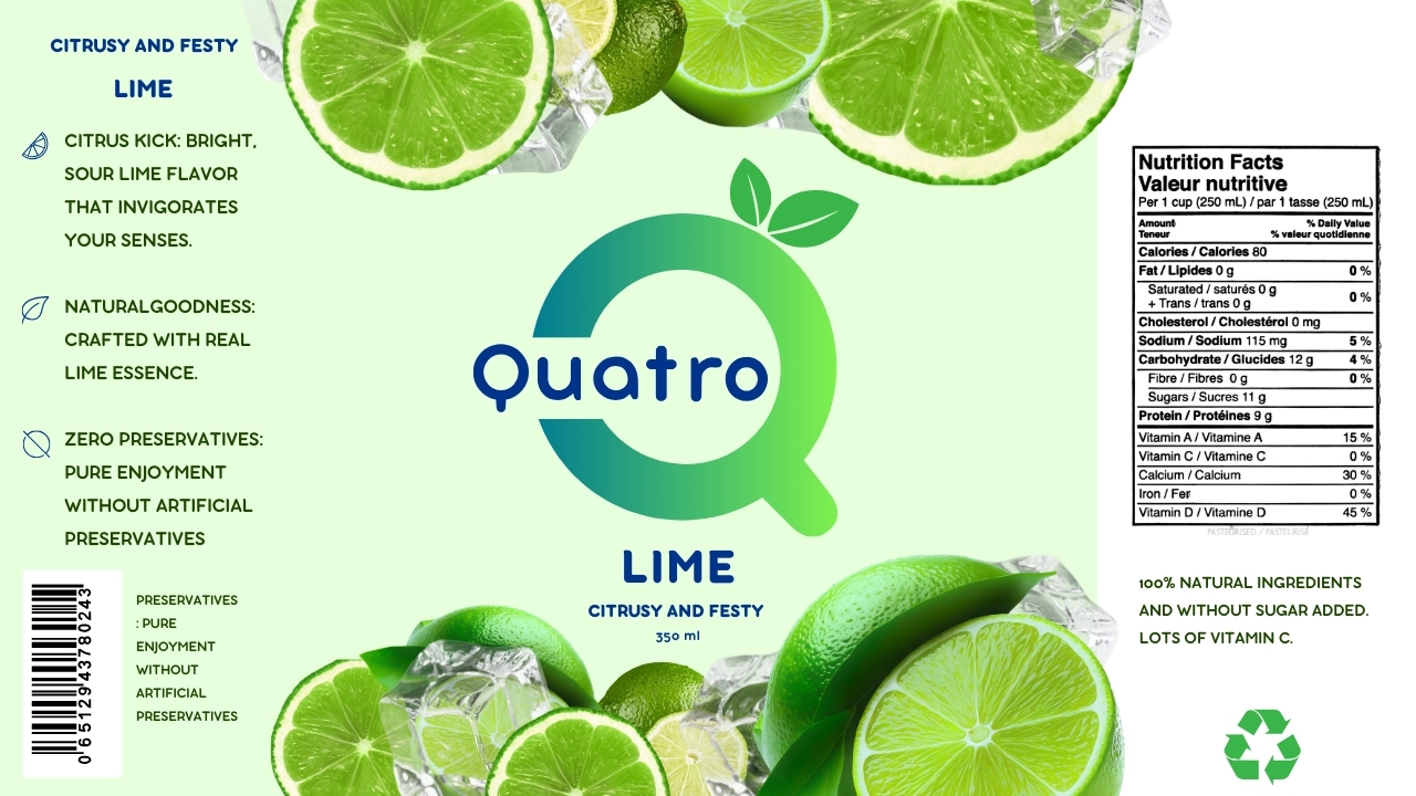
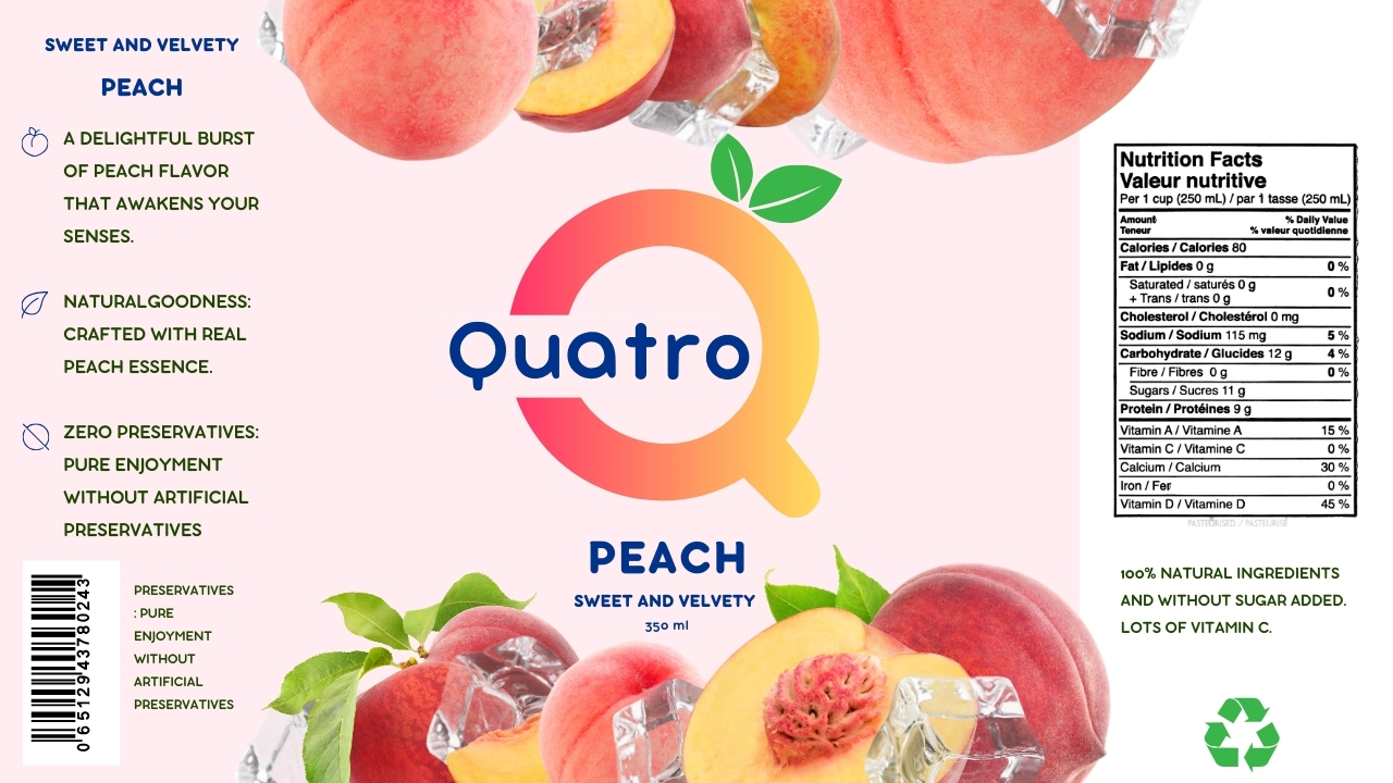
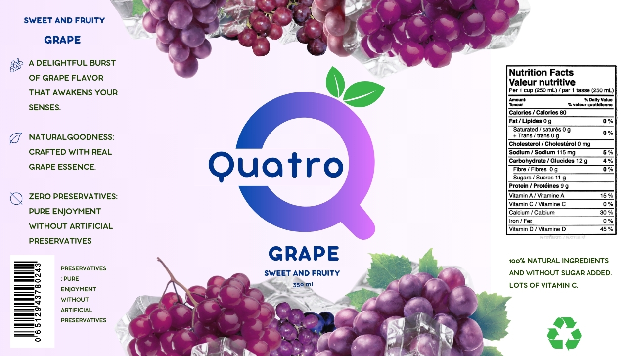
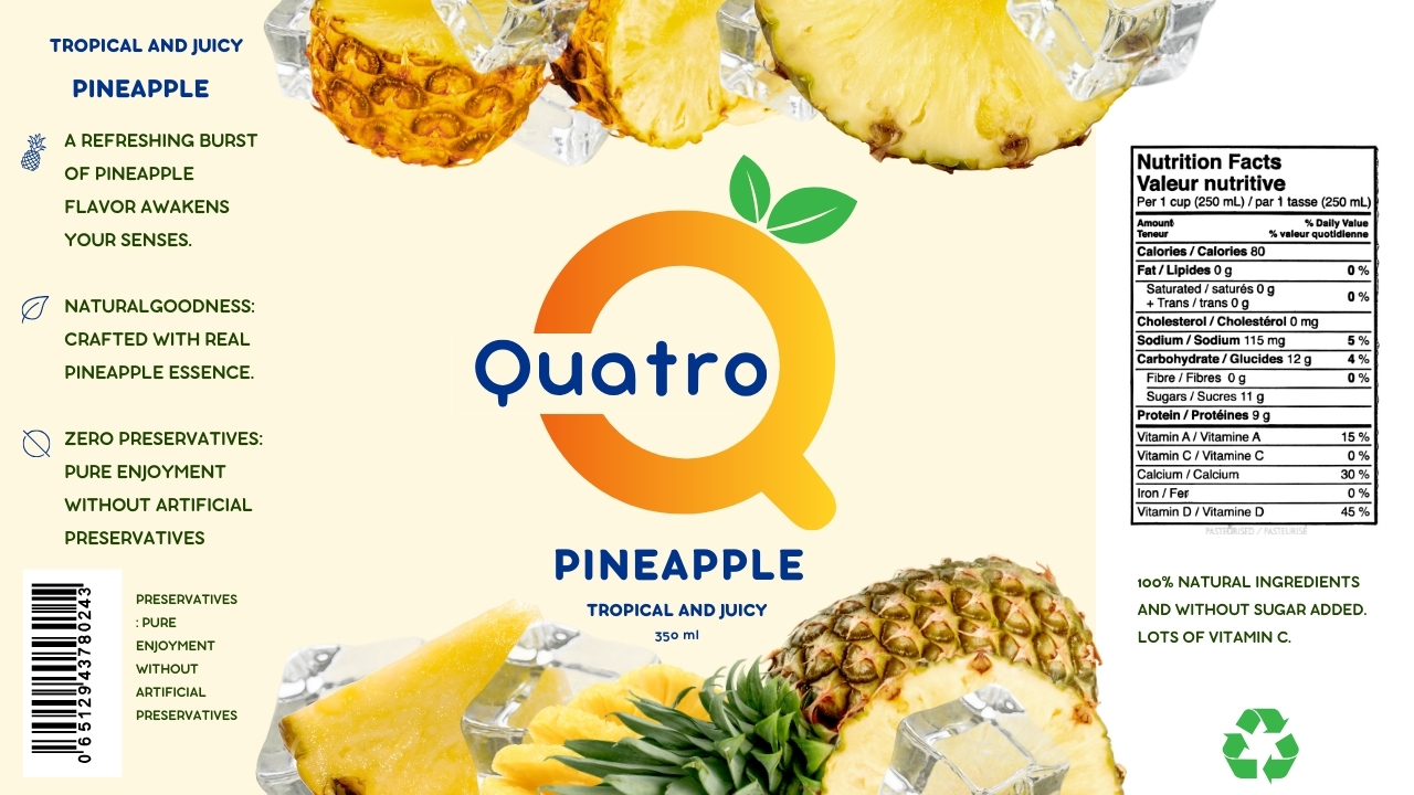
The Quatro drink labels are designed to showcase the natural goodness of each fruit flavor with a fresh and vibrant aesthetic. Each label incorporates bright, appealing colors and images of the fruit in its purest form, emphasizing the product's commitment to using real fruit essences without artificial preservatives. The clean design and easy-to-read text ensure the brand's values—natural ingredients, no preservatives, and refreshing flavors—are clearly communicated. Whether it’s the tangy lime, sweet grape, velvety peach, or tropical pineapple, each label reflects the unique character of the flavor inside, appealing to health-conscious consumers who value authenticity and quality.
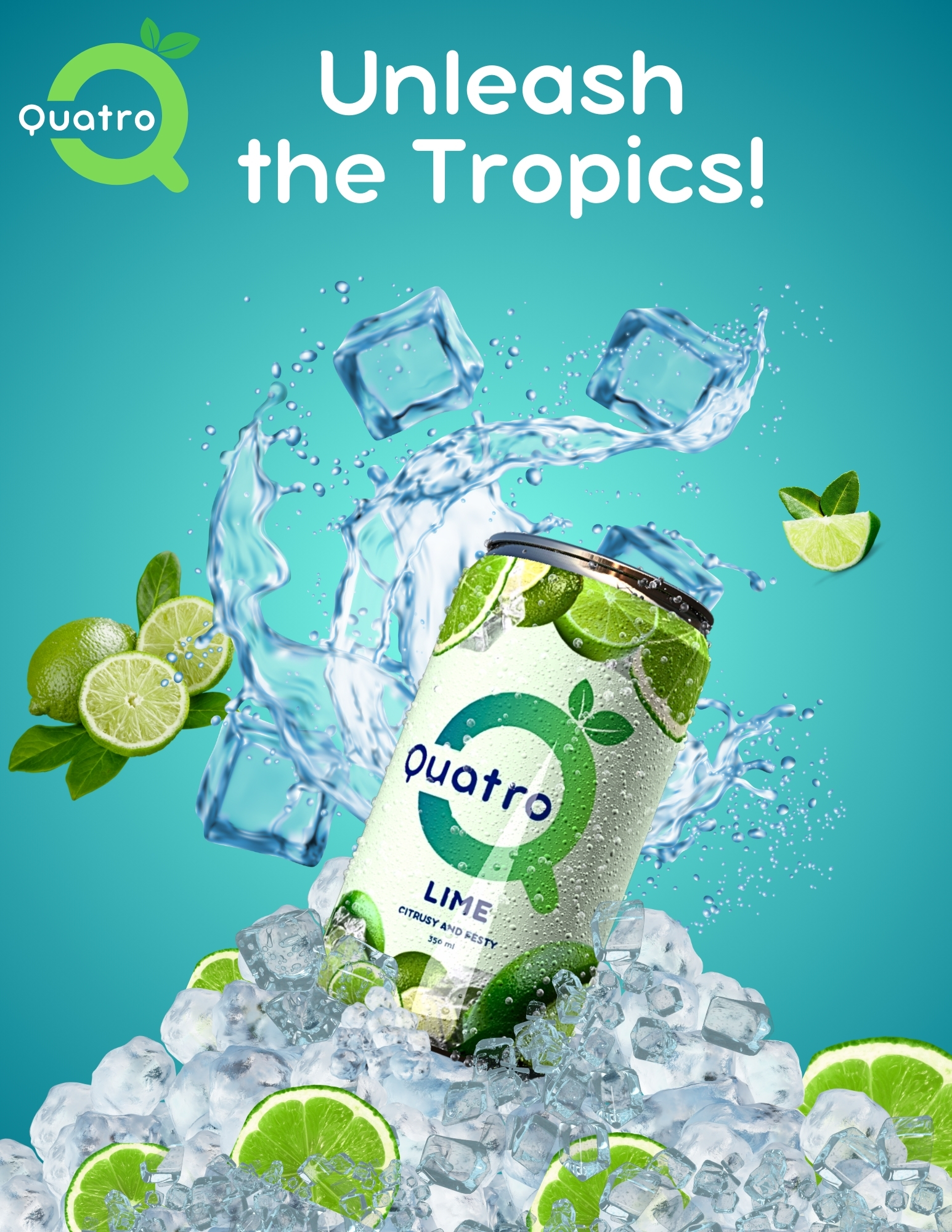


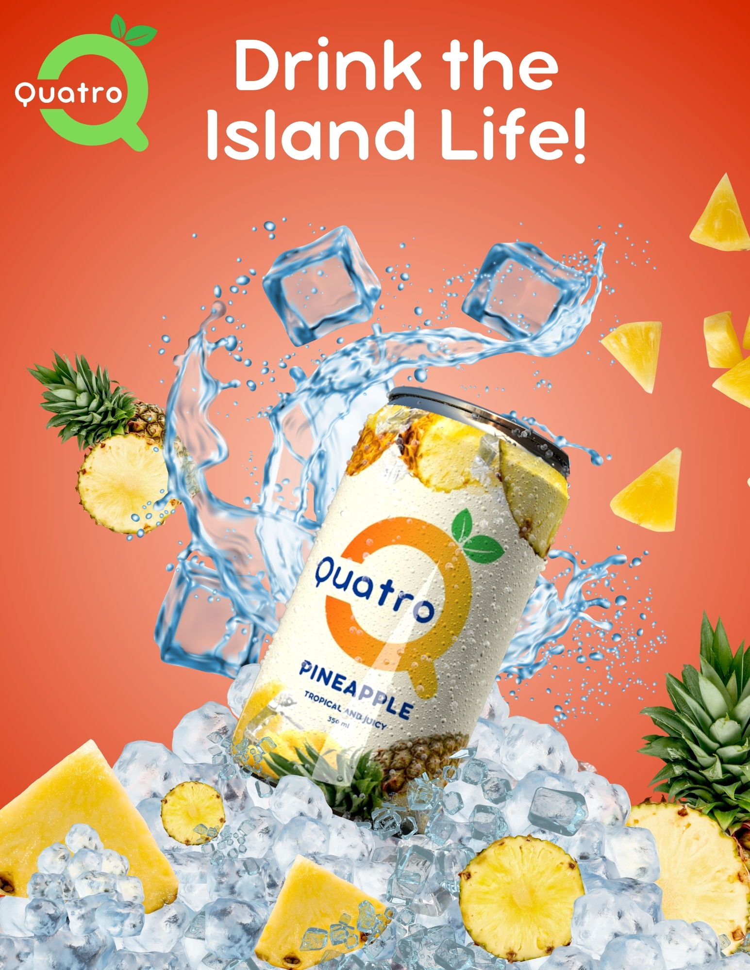
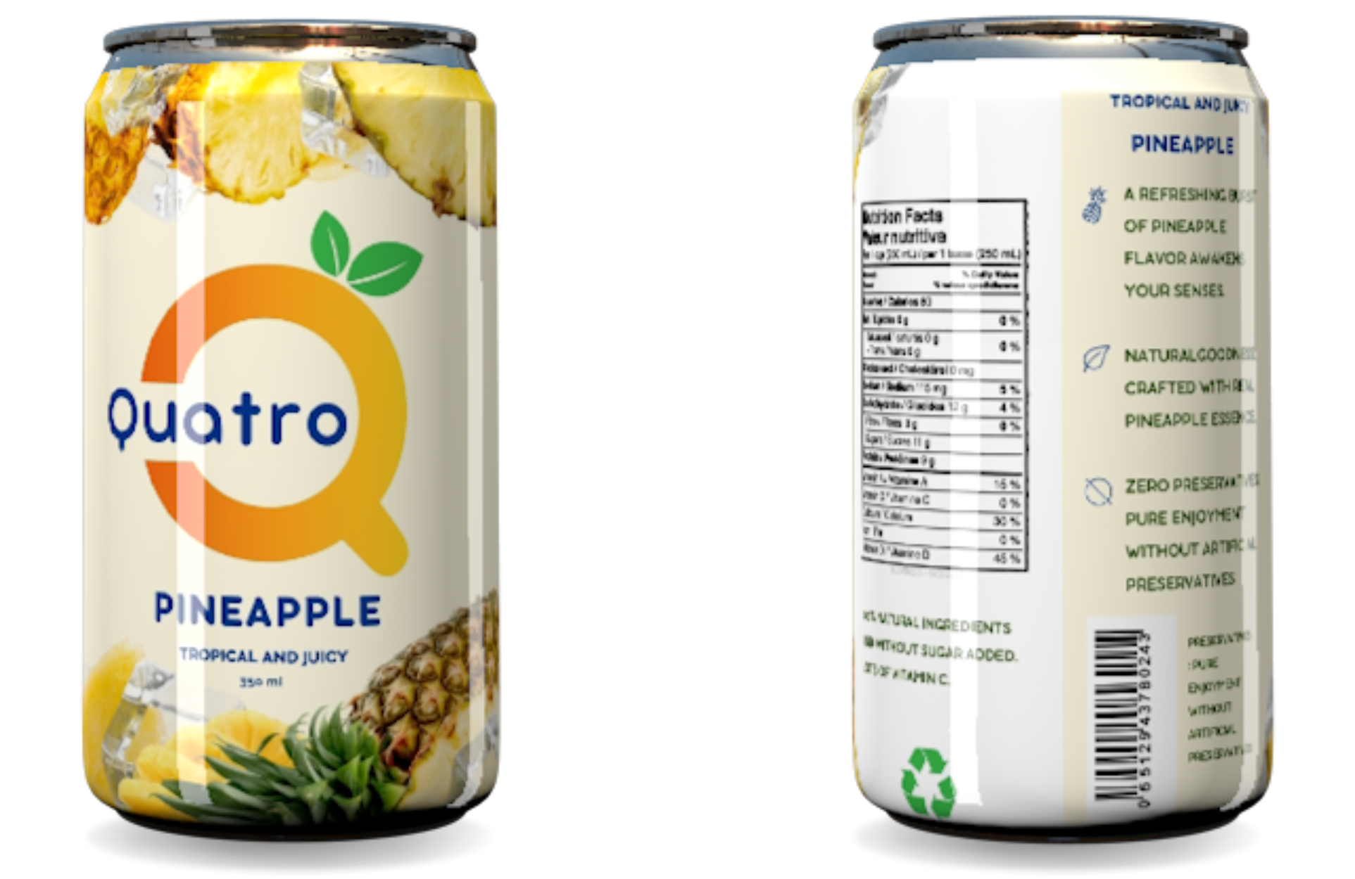
The Quatro can designs are brought to life with vibrant and modern 3D visuals, expertly modeled using Cinema 4D. Each can showcases the refreshing and natural essence of its respective fruit flavor, including Pineapple, Grape, Lime, and Peach. The use of dynamic textures and lighting highlights the natural appeal of the ingredients, making each can visually enticing and full of life. The sleek, glossy finish adds a contemporary feel, while the vibrant fruit imagery on the cans communicates the fresh, delicious flavors inside. The design also ensures clear readability of essential product details, such as the flavor name and nutritional information, combining aesthetics with functionality for a cohesive brand experience.
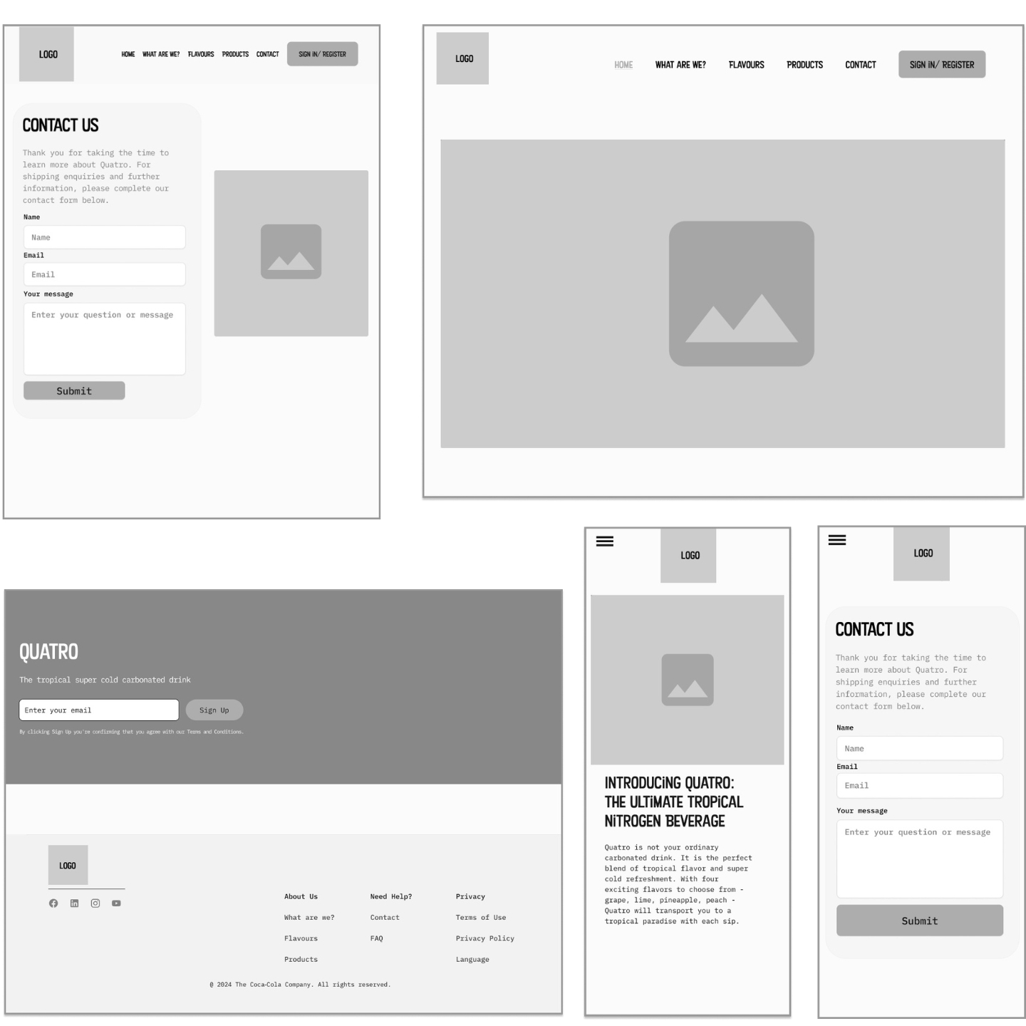
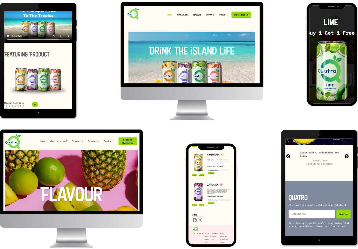
The website design emphasizes a cohesive visual identity through thoughtful use of color, layout, and motion. Soft pastel yellow dominates the header and body areas, establishing a warm and approachable tone, while pastel pink in the footer adds a balanced, playful contrast. To draw attention to key interactive elements, fluorescent accents were applied to buttons and SVG icons, enhancing both functionality and visual engagement. Vivid background colors in hero sections contribute to a dynamic and energetic atmosphere across the page. Additionally, a CSS animation in the landing hero section reinforces the brand’s personality, creating a consistent and memorable user experience that ties the entire design together.
I’m excited to bring my energy and expertise to your next project. Let’s talk!
Let’s Talk